Colour Palette Basics for Non-Designers
You do not need design training to choose good colours. A handful of simple rules gets you to a clean, readable result.
Start with one main colour
Pick a primary colour that fits the feeling you want. Blue often suggests trust, green suggests growth or health, orange feels energetic, and black with one accent colour feels modern. These associations vary between cultures, so use them as guidance, not law.
Build a small palette
A website or presentation rarely needs more than:
- One primary colour for key actions and headings.
- One secondary or accent colour for highlights.
- Neutrals: white, a light grey and a dark grey or near-black for text.
- Status colours (green, amber, red) only where meaning requires them.
The 60-30-10 rule
Use roughly 60 percent a dominant neutral (such as white), 30 percent a supporting colour and 10 percent your accent. It keeps layouts balanced and makes the accent stand out.
Contrast comes first
Beautiful colours are useless if text cannot be read. The Web Content Accessibility Guidelines recommend a contrast ratio of at least 4.5:1 for normal text and 3:1 for large text. Light grey text on white is a very common failure. Use a contrast checker, and never rely on colour alone to convey meaning: add icons or labels so colour-blind users are not left out.
Make shades, not new colours
Instead of adding more hues, create lighter and darker versions of the ones you have. A light tint of the primary colour works well as a background, and a darker shade is useful for hover states.
Pull colours from a picture
If you have a photograph or logo you like, extract its dominant colours with a palette tool and pick two or three that work together. Natural images are full of harmonious combinations.
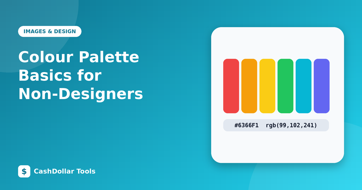
Know your colour formats
- HEX (#059669): common in CSS and design tools.
- RGB (5, 150, 105): how screens mix light.
- HSL (hue, saturation, lightness): easiest to adjust by hand because you can change lightness without changing the hue.
Test in context
View your palette on a phone in daylight and on a laptop in a dim room. Print a sample if the design will be printed, because paper and screens render colours differently.
Final checklist
- Limited palette.
- Text passes contrast checks.
- Accent used sparingly.
- Colours consistent across pages.
Restraint is the secret. A calm, consistent palette always looks more professional than a rainbow.